
One of the techniques Freeman discusses in his book is color in composition, followed fittingly with color relationships. I feel as though these two key concepts go hand in hand when shooting color photography, and a good contrast in color can really make an image pop.
He describes color in composition by explaining the red-yellow-blue (RYB) painters primaries and red-green-blue (RGB) light-based primaries and the color wheel. Color has just as important of a role in photography as it does in painting, and the ability of a photographer to edit things such as the contrast and saturation in a photo post-production is monumental.
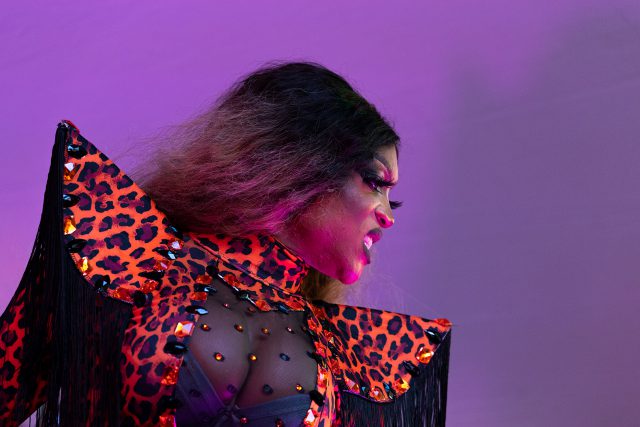
Freeman dedicates a section to discussing the meanings of colors, as well. For my purposes, I just want to discuss red, yellow, orange and violet, as they are some of the most influential colors in the photo I chose.
Freeman describes red as “one of the strongest […] colors,” and calls it energetic and vital. Conversely, he describes yellow as being “vigorous, sharp, and insistent,” and that against a darker background it “appears to radiate light itself.” In my photo, red and yellow take the form of orange, which Freeman says takes qualities from both its parent colors. Orange, he says, is “warm, strong, brilliant, and powerful,” and I believe the outfit paired with the subject’s expression certainly has an air of strength and power.
The background of my image is purple, Freeman makes a small note that violet is often confused for purple, but the meanings he uses for both colors are strikingly similar. Violet to him is a mysterious color, not easily replicated in real life. Purple is “religious, regal, and superstitious,” all connotations that have a mysterious aspect to them. In my photo the background is a striking purple, and I think the best descriptor for it would be regal. The subject is a drag queen, after all. The subject is also bathed in a purple light from the stage strobe lights, giving her skin, hair and outfit subtle purple highlights.
Freeman also discusses color relationships, which I will only just touch on here. One of the more important things he mentions is color proportion, which is the ratio of warm to cool colors that is most pleasant to the eye. He also discusses harmonious and clashing colors. Colors on the same side of the color wheel will naturally be more harmonious with each other, while colors on opposite sides of each other (think orange and blue) are naturally complementary, so even though they are contrasting temperatures, they still look good together.
In my photo, the colors are neither of these. Not naturally harmonious or complementary. Yet I still believe it looks good. The orange stands out in a way that could clash, but the dominant purple lighting helps to tone the harshness down. Freeman even brings up this concept of clashing color in the chapter, specifically bringing up the Japanese use of pink and lime green used in a “cute” manner.
To me, color is just as important in a photo as the subject. And it’s important that it compliments the subject and the photographer’s vision and concept for the photo. My photo was one of almost 6,000 I took between 7:30 and 8:30 PM on Saturday night in the very front row of the PRIDE drag show. The subject, drag queen Lyna Koke, looks angry in this photo, but she also looks powerful. The colors and their contrast help to add a feeling of frustration with the deep orange of her outfit popping out of the surrounding colors to create a focal point that puts an emphasis on the subject and what she is doing.
I think color is inherently complementary to the photo. As Freeman shows in this chapter, color is very much optional, and great photos can be taken without a drop of color. This means that when color is present, it, by its very nature, must be complimentary. It has to add something to the photo that wouldn’t otherwise be told in a black-and-white still.
For experimentation, I turned my photo grayscale in Photoshop.

When looking at both side-by-side, its easy to see what color adds. The grayscale image lacks the passion that is so evident in the color photo, and could be described as ‘dull’ by most observers. I think an experiment like this is interesting, and it shows how important color is in a photo that utilizes it well.